5 simple composition rules to take better travel pictures
Composition is how you can guide the viewer’s eye through the picture to get the most aesthetically pleasing results of your pictures. A popular method to apply for those just starting out with photography is the rule of thirds. However, there are a few simple rules of composition that will help you to take better travel pictures. Here are the most relevant composition rules and techniques you should know.
Photography composition, rules and techniques to take better travel pictures
1. Rule of thirds
The rule of thirds divides the image into three rows of three, splitting the image into nine equal blocks. The reasoning behind this rule is that placing objects within these areas helps to create more interest in the image than if you were to simply center the subject.
2. Leading lines
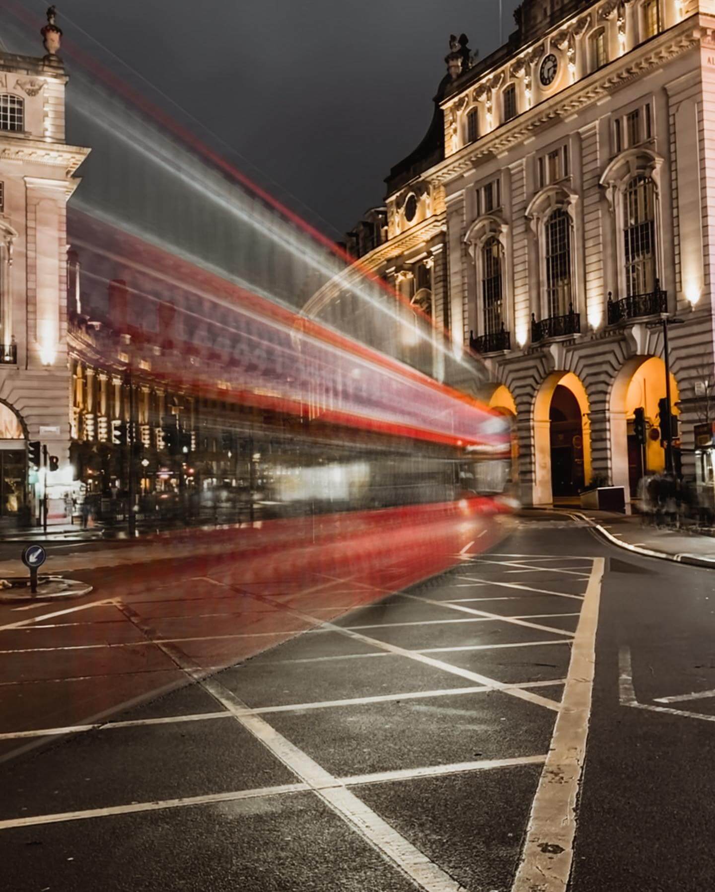
Leading lines guide the viewer’s eye to the subject. Anything from bridges to stairs, the lines or curves will be framed and positioned by the photographer to draw the viewer’s eye towards a specific point of interest. Lines in the roads, sand dunes, waves are common for this technique.
Below you can see the leading line examples.


What you think, you become.
What you feel you attract.
What you imagine you create.
– Buddha.
3. Symetry
Symmetry most of times goes against the rule of thirds, but can help you to remove or minimize additional distractions and focus the eye. Symmetry defines something being clean, proportional and balanced and will make pictures appear neat, tidy and clinical. In photography this technique appears very often when parts of your composition mirror other parts.
4. Color
Colors are an effective way of catching the viewer’s attention and can be used to change or influence the mood or feeling of an image. The color scheme you choose goes a long way to influence the feeling of a photo. For example, the clothes you wear can make your pictures blend or pop, depending on what you want to achieve. When we look at a well designed color photo, some effects can occur, for instance, warm colors can excite your mind, while cool colors calm your mind. Dark objects can advance while light objects can recede. Understanding and, wherever possible, implementing these learnings will help you make better photographs.
5. Framing
As the name suggests, when you use other elements within the image to frame the subject you are applying the framing techniques. This can be particularly useful in adding perspective or creating depth. For example, you might shoot through a doorway, pull back curtains, branches, fences, tunnels, or arches to highlight your subject focus.


